MoneyMentor
Summary
This project served as the capstone project of the University of Washington UX Design course. We were presented with a project brief aimed at guiding us through the entire User Experience design process. Beginning with understanding design think and conducting user research, user testing. concluding with UI design and creating clickable prototypes.
Role
UX Designer
Method & Tools
Method: User Interviews, Personas, Concept Testing, Prototyping
Tools: Figma, Balsamiq, Mural, Otter.ai
Process Roadmap
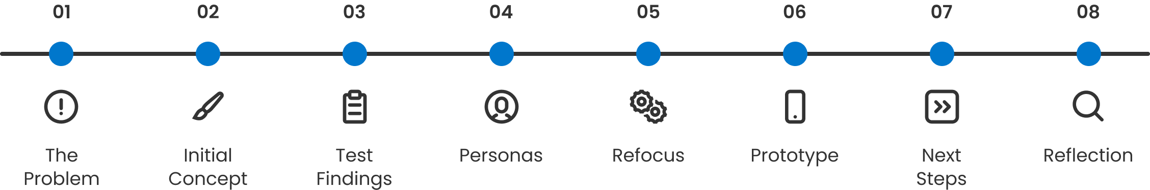
Design Process
01
The Problem
There were many problem statements to choose from. Topics such as distracted by technology or finding organic food. What intrigued me most was the financial literacy issue—it resonates personally with many individuals in my life. If only they had the knowledge to navigate their finances effectively.
Problem Statement
How might we simplify and broaden financial planning and education to be accessible for individuals from diverse financial backgrounds?
02
Initial Concept
Initial concept began as a mobile application, the app had two simple features. One being a library of financial definitions and the other being a way to book financial advisors. The definitions are so users could always rely on the app to have the concepts broken down and in a consistent format. While the financial advisors would be hired out by MoneyMentor, using the spaces tied to the advisors location (e.g bank) to host these mentoring sessions.
03
Personas
To understand user needs, I interviewed some people, recording interviews with Otter.ai to transcribe the interview for future reference. Based on our interviews, we developed two personas representing individuals seeking an educational finance application.
Optimal Allocator
They are always looking for ways to improve spending habits and eliminate extraneous costs. They might have low to middle income jobs and use credit purchases to assist their lifestyle goals. They may need some help formulating long term financial goals.
Savings Steward
Proactive in building financial stability with moderate risk-aversion; they find satisfaction in seeing their savings grow over time and prioritize a financial safety nets for emergency funds. They are focused on long term goals and balancing them with their immediate needs.
04
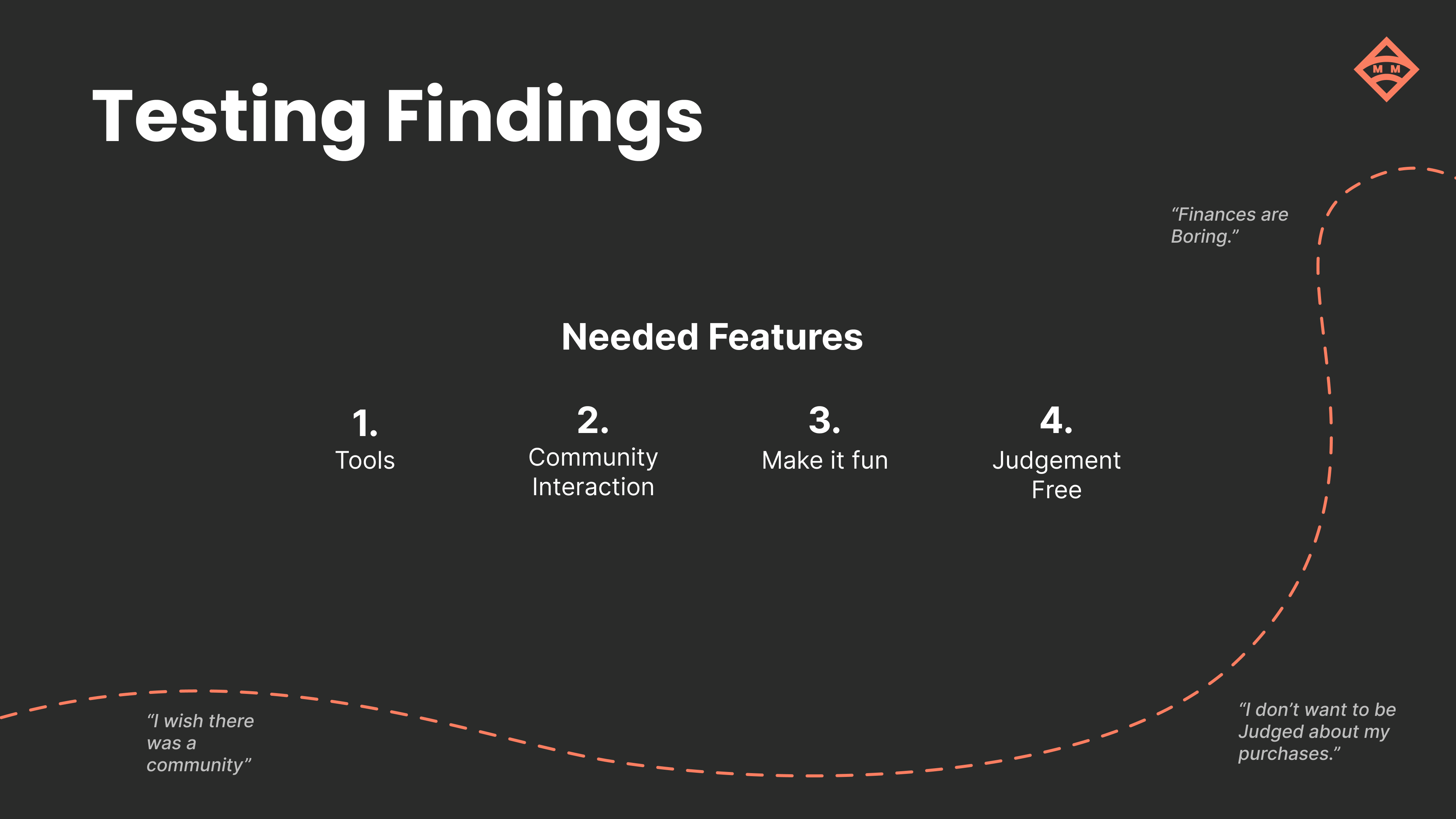
Concept Test Findings
We then sought out our target audience and presented them with four concepts. Showing snapshots of each concepts, along with an explanation we had the users choose one and explain why they chose it. Then we would go more in depth with the chosen concept and receive more feedback on this concepts specific features.
The four concepts presented were:
- Gains: Gym metaphor for financial education, where you set goals and receive rewards based on these goals.
- MoneyMentor: Financial library of definitions/concepts & the ability to schedule meetings for in person mentoring.
- WealthQuest: Gamifying the learning of personal financial management, through making concepts into games.
- Abacus: Financial calculator tool with templates of popular financial equations built in.
During concept testing there were no stand out concepts, they were all chosen evenly, and each had features users wanted. At first this may seem disappointing but to me it meant that the users wanted an app that would have the four main ideas combined. Along with One of the most impactful quotes from testing was "I just need a nudge in the right direction.". This quote will steer the direction of MoneyMentor's future.
05
Refocus
From the testing I understood that MoneyMentor's direction had to be altered in order to satisfy user needs and goals. These ideas being:
- Tools: Financial tools to bring users back to the app as something they can rely on to use in person.
- Community Interaction: Sections where others can interact and tell their stories.
- Goal and reward system: Encourage users to keep pushing forward with savings and learnings, gamifying the system to make it fun!
- judgement free zone: The app must convey a non-judgmental tone to establish trust with users regarding this sensitive topic.
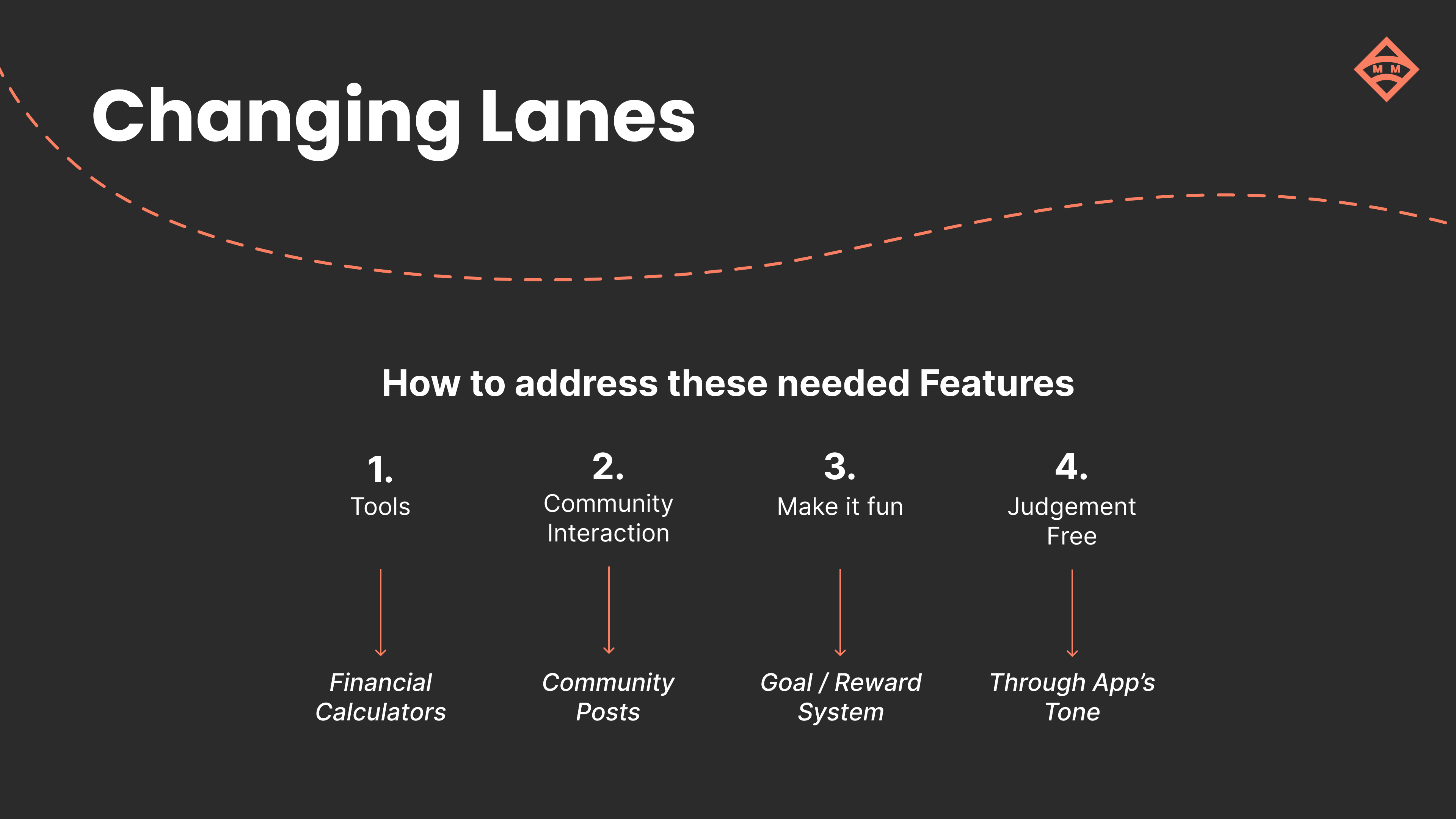
So how am I going to implement these features in a prototype?
- Calculators: Calculators with templates to make inputting necessary information easier and add more utility to the app.
- Community Posts: Crafting a community tab for interactions with others and sharing ones own experiences.
- Point System: Creation of a point system where users can earn points to spend on prizes such as gift cards.
- Tone: Present a tone of judgement free mentoring and community when it comes to the copy and colors of the app.
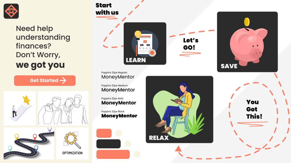
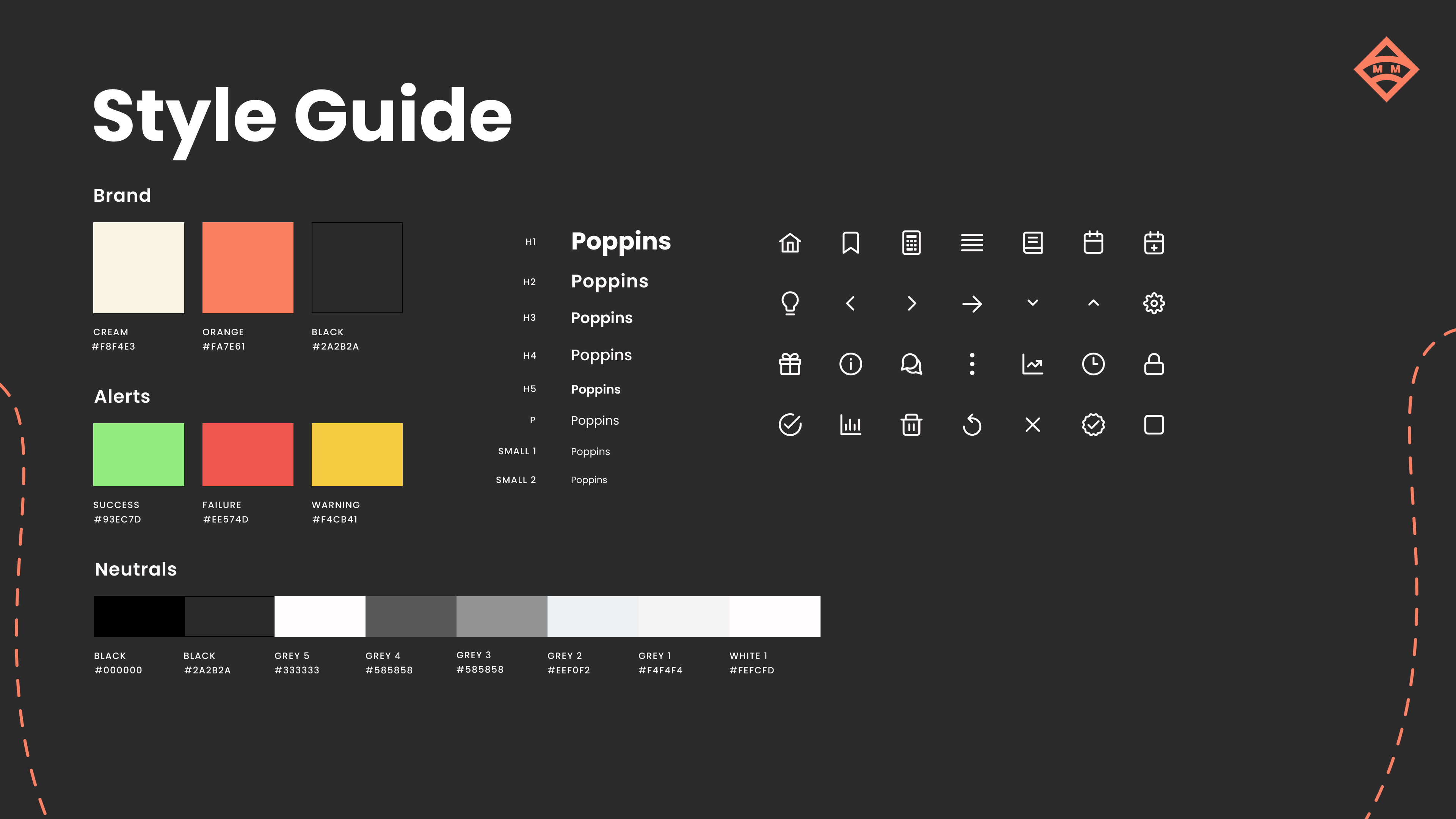
Lets take a look at the moodboard and style guide made to portray the judgement free tone. The app's atmosphere feels more like having a supportive friend by your side, ready to tackle the problem together.
06
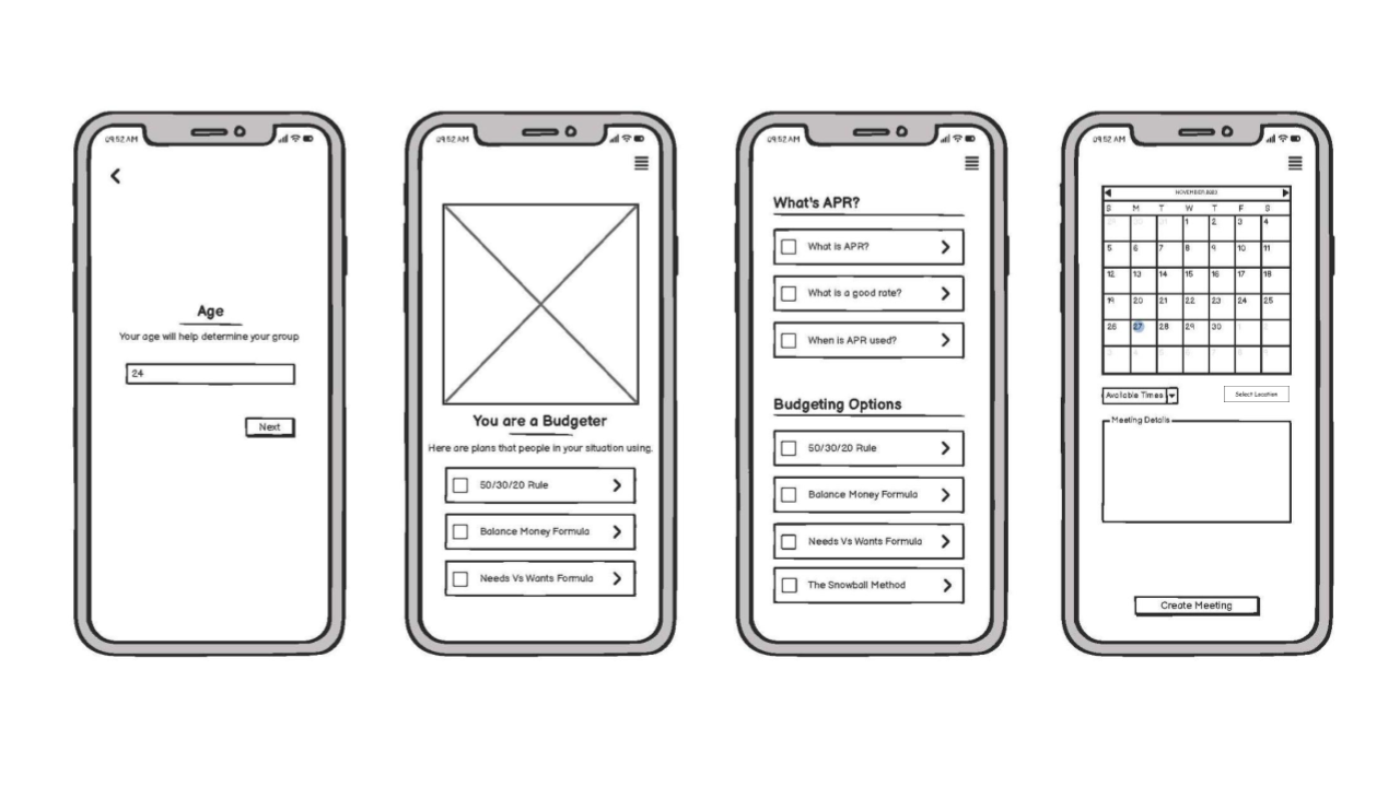
Prototype
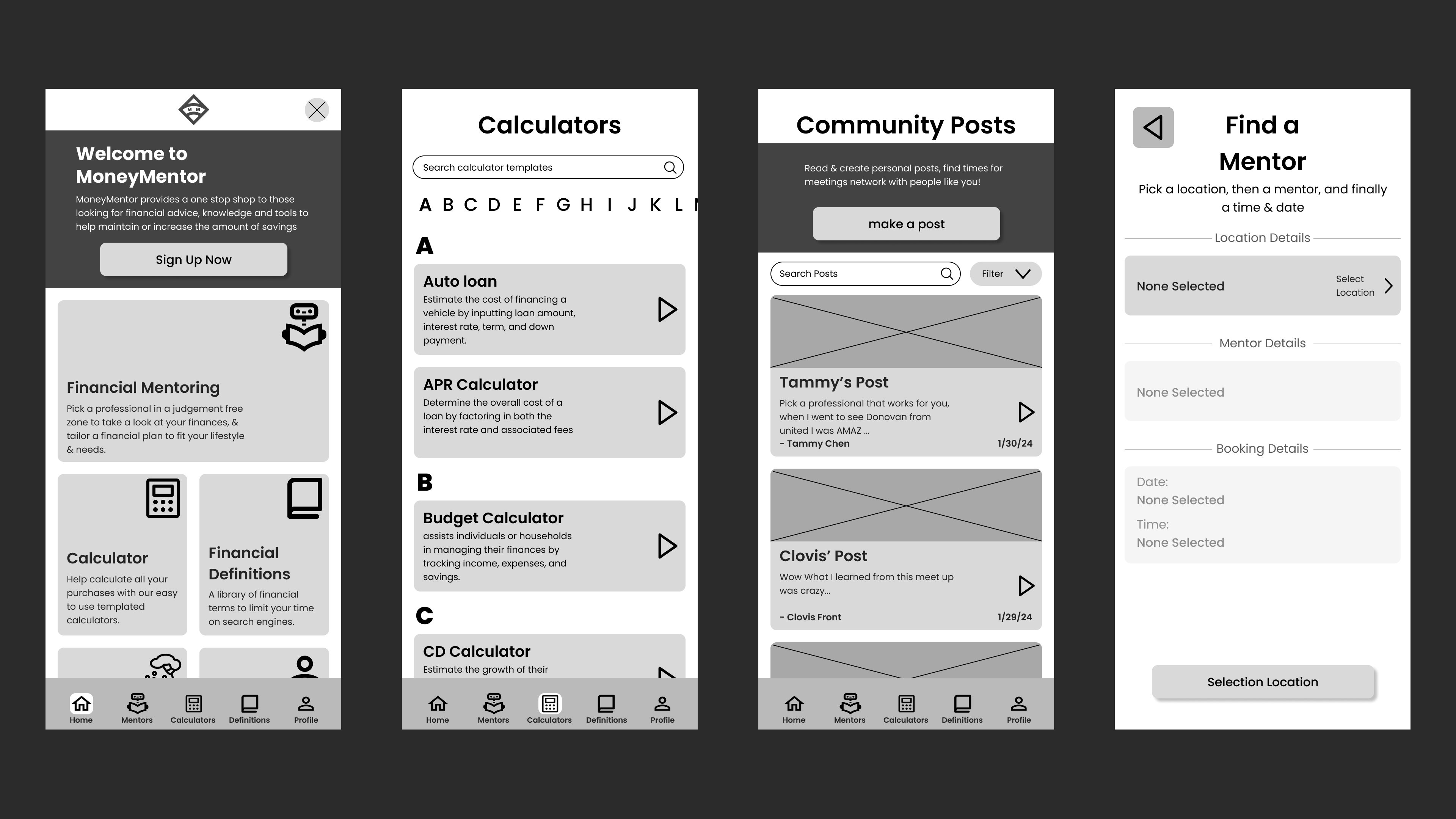
Low-Fidelity Prototype.
Here's the early prototype of (from left to right) home, calculators, community posts, booking a mentor flows. Giving a general layout and idea of how the flows will be interacted with.
Hi-Fidelity Prototype.
New features introduced with higher fidelity include a recap on the home screen, enhancements to the booking flow incorporating ratings, text, and mentor photos, community posts with favorites, calculators with favorites, and dropdown definitions under the header. Additionally, recap and settings were added to the profile tab. The definitions tab was temporarily removed during the high-fidelity prototype stage, with plans to reintroduce it later.
Key Takeaways
07
Next Steps
- Now That I have Hi-Fidelity user flows, usability tests on these flows would be a major next step to ensure it has what our audience is expecting. Then iterate on the design based on user feedback.
- Develop a more thorough reward system for how points are earned, in order to prevent users from abusing the reward system.
08
Reflection
Iterative Design
There were many points during the UW UX course were I felt more usability would really help me nail down features and UI elements that appeal to the user. Asking some peers helped fix some of my designs, but they are not users. This made me think, That I should frequently seek feedback from peers and perform more usability tests in order to course correct my designs. This taught me the value of iterative design.
Don't be afraid of being criticized.
I learned that criticisms can hurt about the designs, especially when testing the concept and people called mine boring. But from that feedback I was able to change that boring direction the app had into something way more fun and interactive. I learned that Feedback is a gift use it wisely.
aaaaaand thats it! Thank you for reading my MoneyMentor case study. To take a look at the final prototype click the link below.