
Helldivers 2 Accessibility & Design
What is Helldivers 2?
Helldivers 2 takes place in a science fiction universe, in which humanity is now united under the "managed democracy" of Super Earth. The Helldivers are elite soldiers sent by Super Earth to fight the Galactic War and protect the planet and humanity from various alien and foreign threats.
Why Bother?
Helldivers 2 is one of my favorite video games, I hope to attract the attention of those developing this game in order to fix various pain points other users and I have noticed during gameplay. I aim to bring about positive changes for the game.
The Problem
During gameplay, I observed several areas where accessibility and quality of life (QOL) features could be improved to enhance the experience for all players. These improvements range from addressing scrolling issues and revealing hidden information to improving contrast and ensuring accessibility for color-blind individuals.
Accessibility
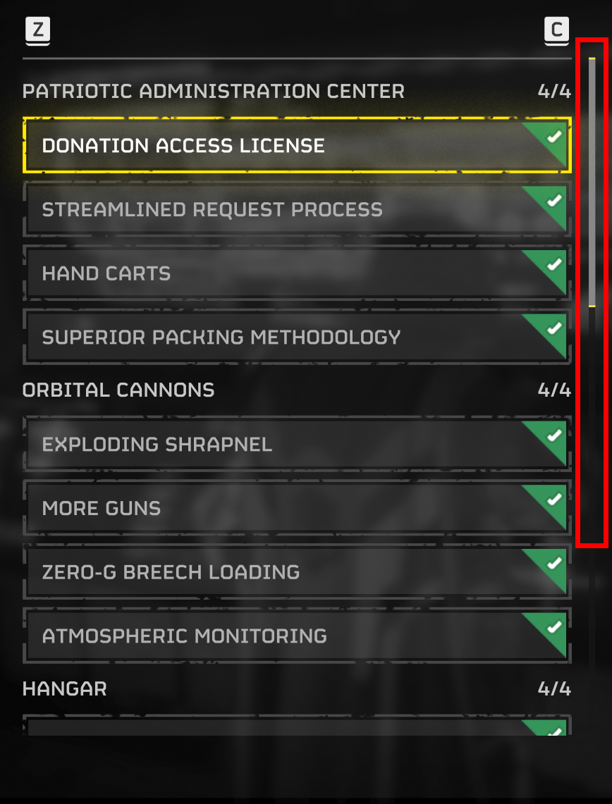
Scrolling
On the ships module and stratagems screen, the scrollbar cannot be dragged in order to navigate through the menu. Since the menu is quite extensive, this lack of functionality poses challenges for individuals with motor impairments who find traditional scrolling methods difficult. Additionally, for those without impairments, using the scrollbar is simply a faster way to navigate. Implementing this feature would be a quick fix and significantly enhance the user experience for all players.
Contrast
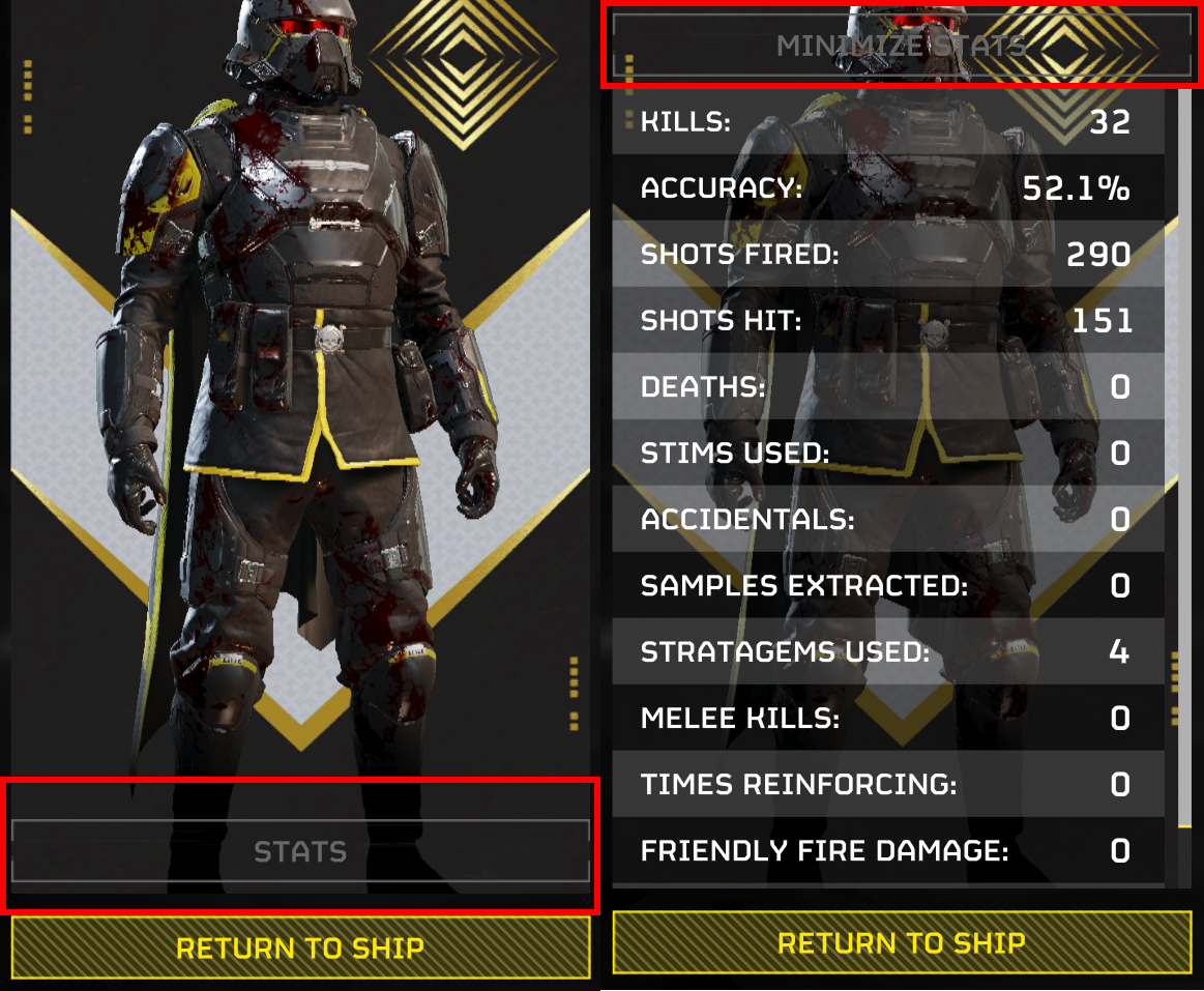
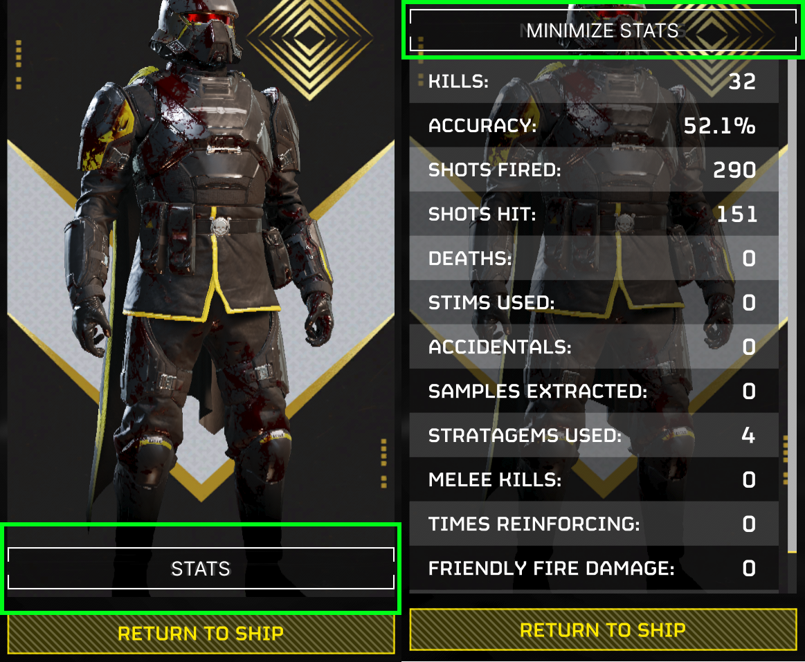
There are two main issues related to contrast: the stats button on the after-mission screen and the world maps.
First is the after mission stats button, The stats & minimize stats button has very low contrast.
since there are many customizations for player backgrounds, (the banner behind the soldier) this button needs to be visible for all colors.
A simple white outline with semi-transparent black background will solve this contrast issue for all types of player backgrounds.
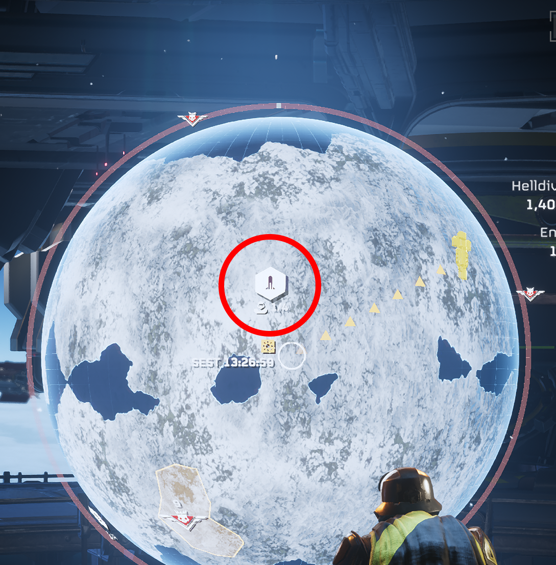
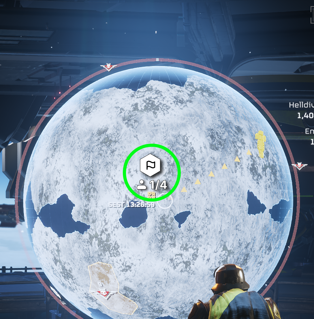
Second here are two images of a snow planet, picking mission can be very hard with white on white.
I see they currently have a shadow but its fairly small, by making that larger and adding a black border
to those UI elements will greatly enhance visibility. Additionally, making the mission select screen slightly
larger would benefit visibility in general.
Finally they need to improve contrast when it comes to text for the UI for player names and mission results screen.
Adding a shadow to the text will help immensely with this.
Colorblind Mode
Colorblindness is a relatively common disability, and given the frequent use of red in this game, a colorblind mode is necessary. Here are some examples where red appears. A quick fix in some cases could be increasing the saturation, while in others, a dedicated option in the settings menu will be needed.
Quality of Life
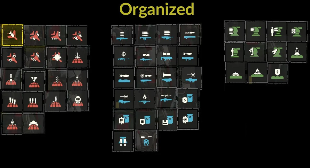
Organization
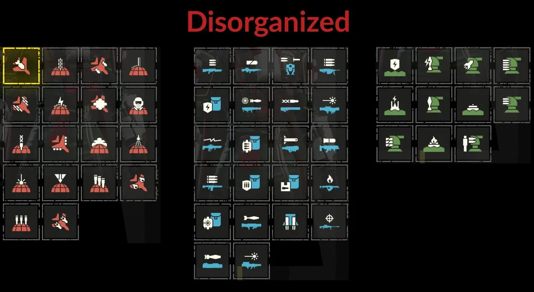
Here is the stratagems select screen, where you can choose abilities to call upon during missions to aid you in various ways. Currently, the stratagems are disorganized, making it difficult to locate a specific one. Organizing them would not only satisfy me but also align with human psychological principles, such as the Gestalt principles. Humans naturally group similar objects together. For instance, having airstrikes grouped together allows users to start there and then perform a linear search to find the specific stratagem they need.
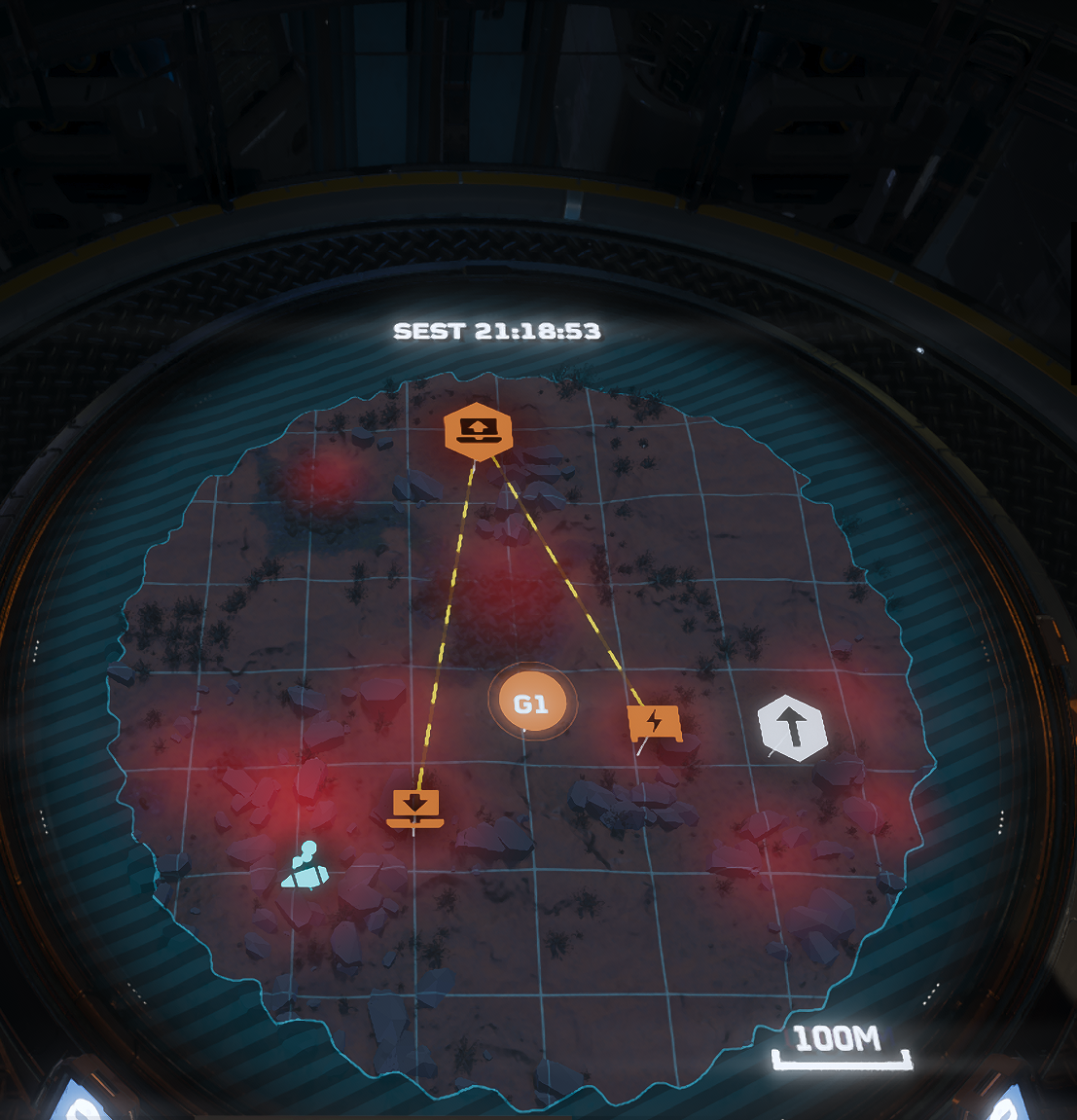
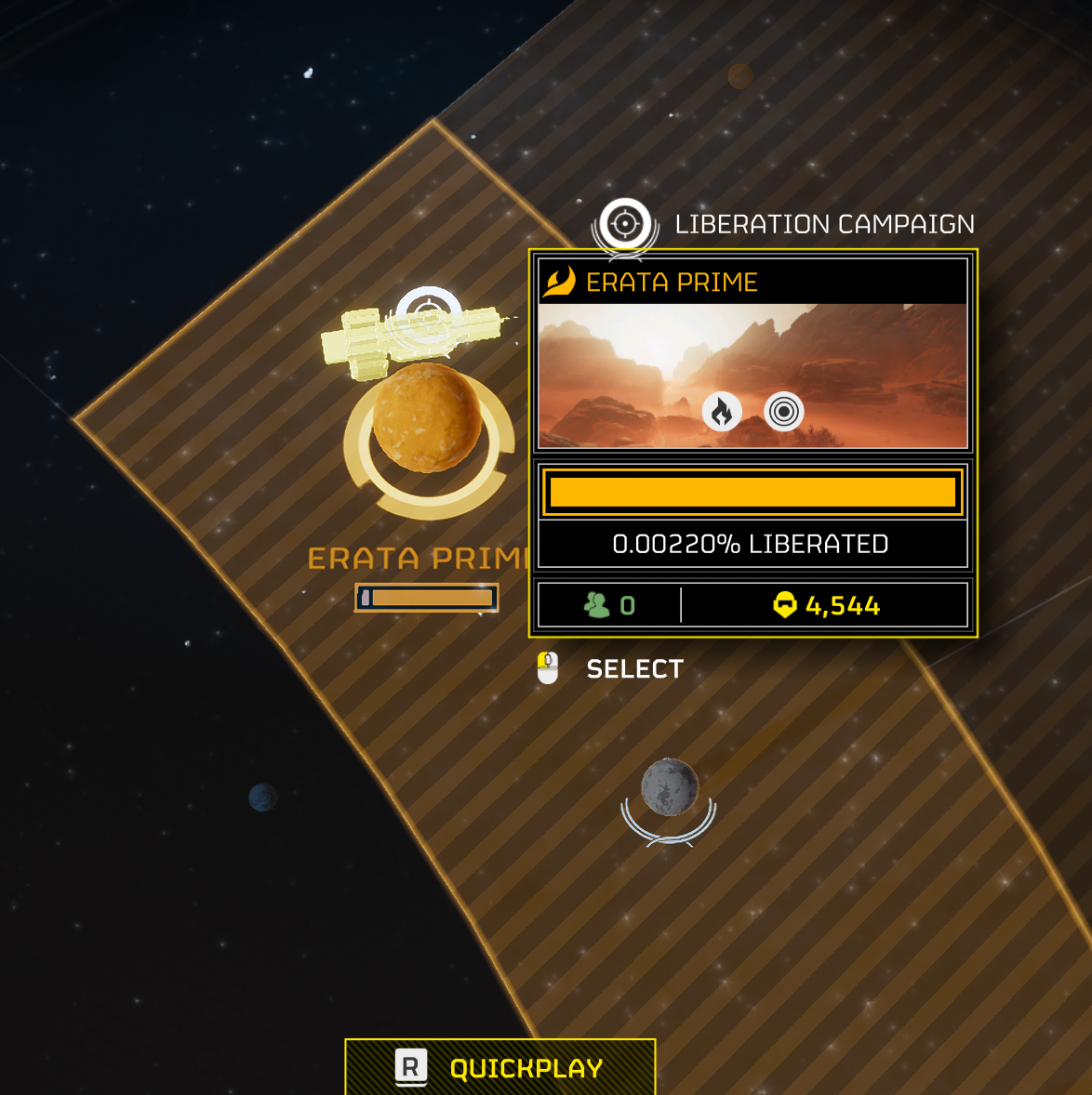
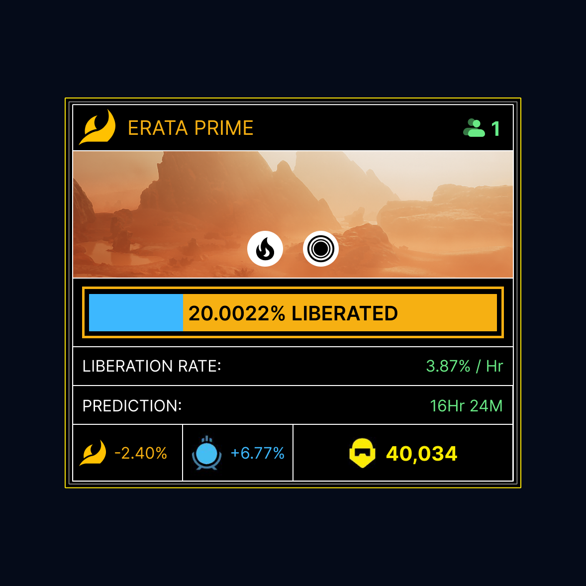
Hidden Information
On the left side, you can see the extent of a planet's liberation, its modifiers, the player count, and friends present on the planet. Meanwhile, the right side I created a more detailed version of this menu that displays additional details like liberation rate, liberation prediction, resistance, and supply lines. Players would greatly appreciate having access to more information, to optimize the spreading of "managed democracy".
Gameplay Clarifications
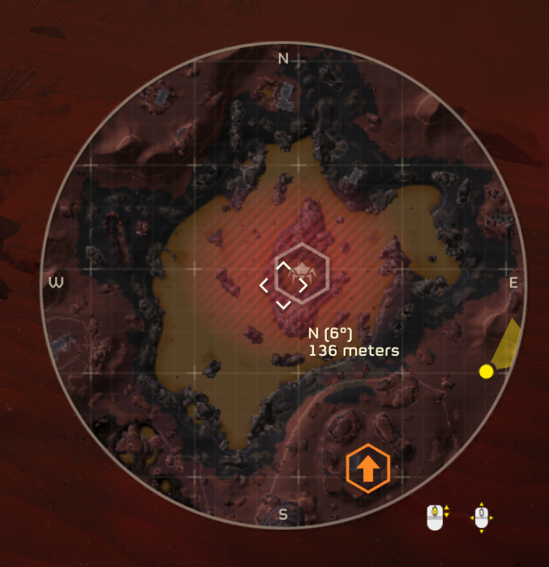
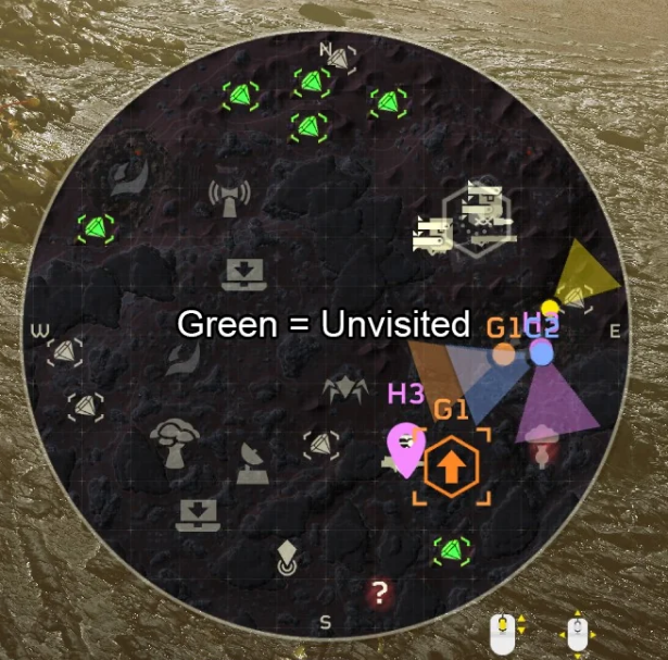
The in-game map, should have a different color for locations that haven't been visited yet. This will clearly tell the player what they missed on a mission, rather than having to guess/remember if they have been there or not.
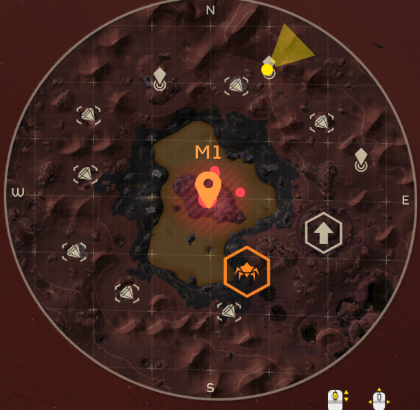
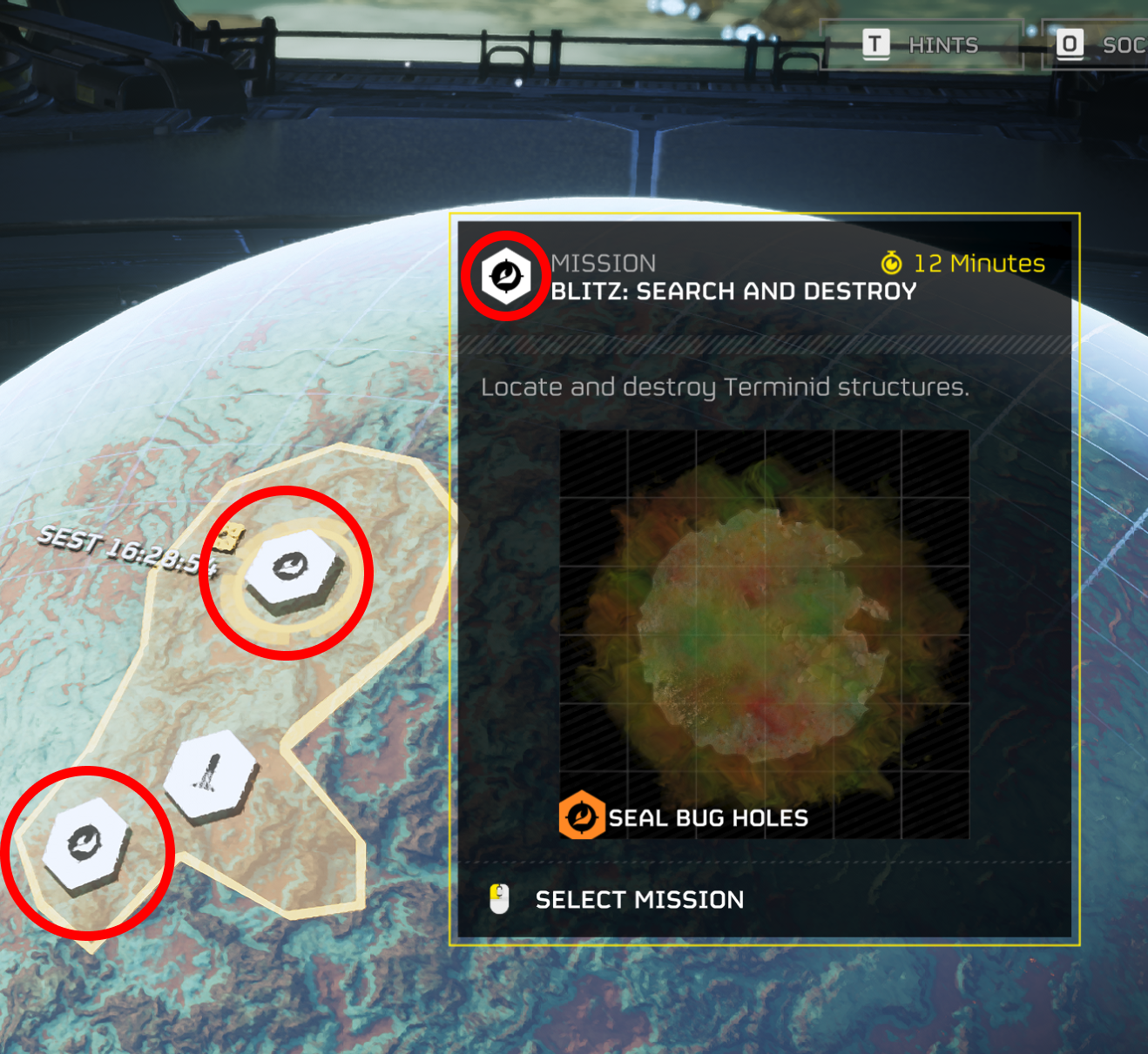
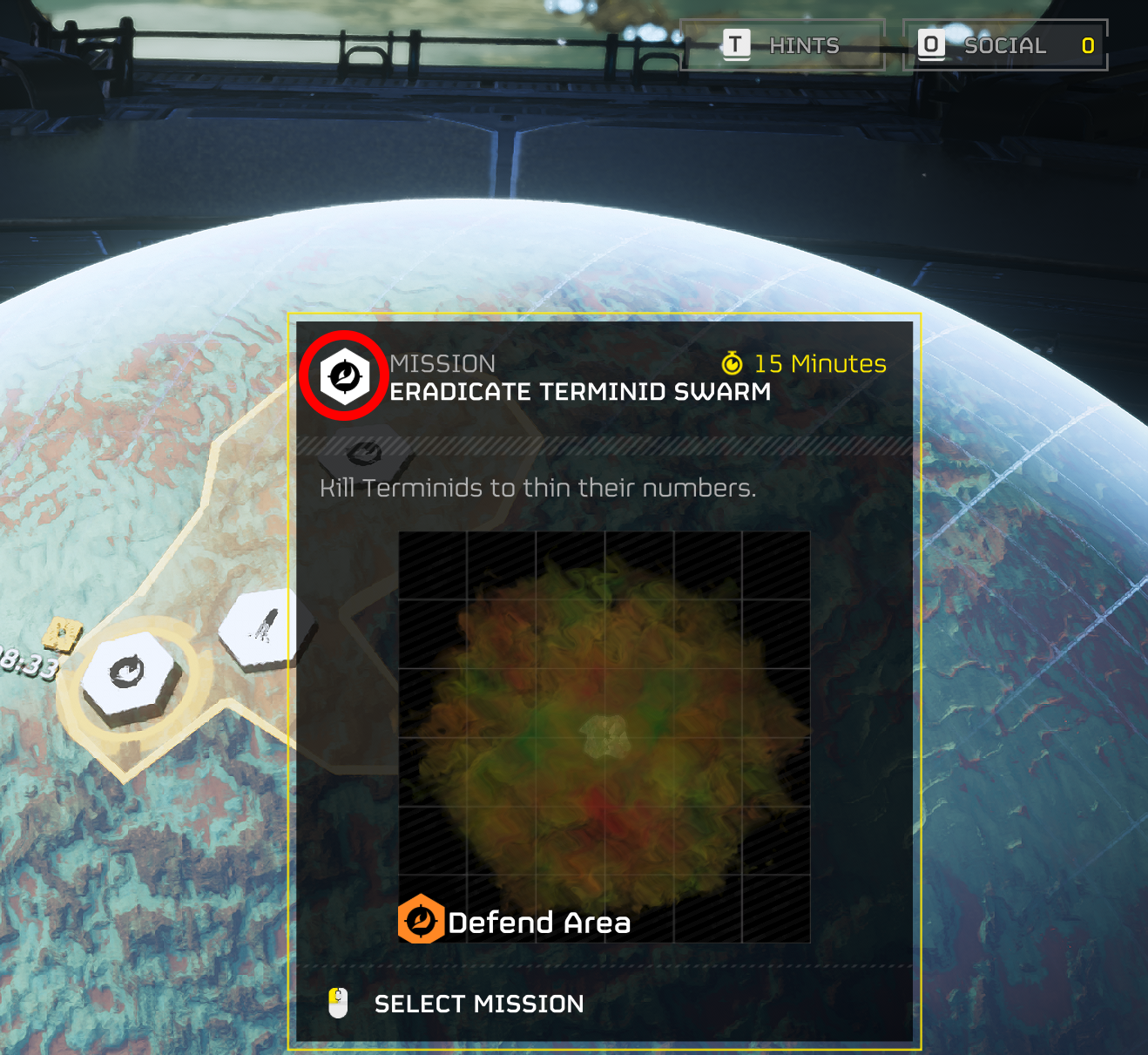
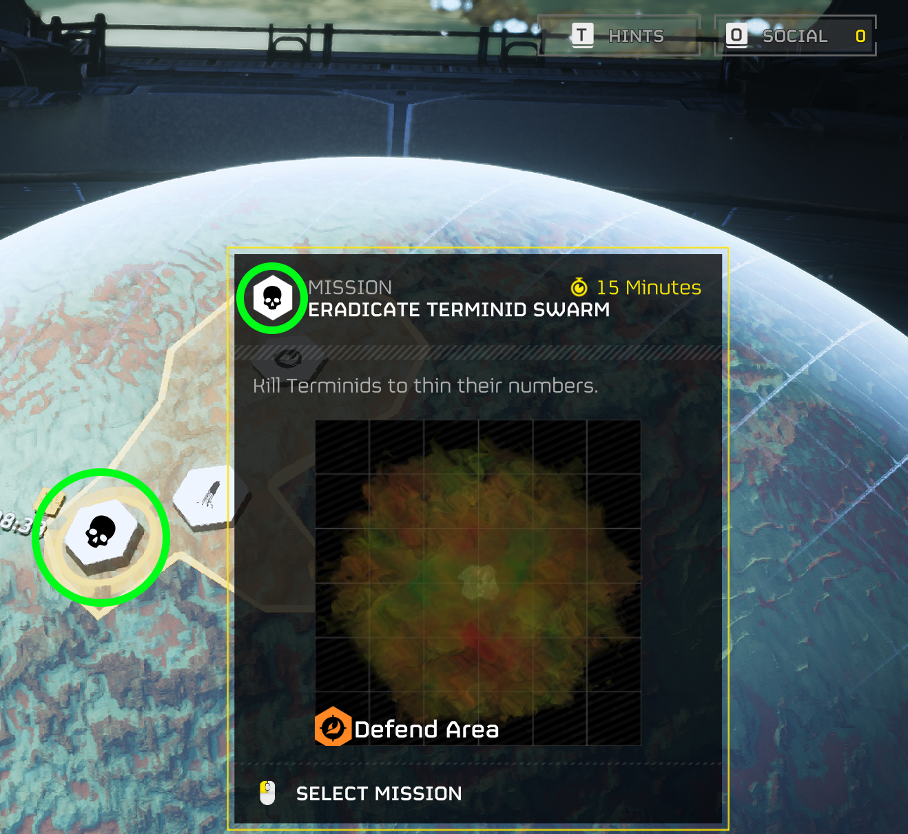
Two missions have the same icon, making differentiating them impossible without selecting the mission. Those missions being Eradicate and Blitz missions, another simple fix would be to change an icon. I made a mockup changing the icon for the eradicate mission to a skull to give it, its own identity.
Outcome
Posted on Forums & Figma
They added shadows to the text on the mission results screen, players name and player titles! They are currently in works for fixing these issues I brought attention to, I will add photos once these changes have been made. I've also shared the assets with the figma community for fans of the game, take a look below!

