Iterate UX Logo Design Challenge
The Design Challenge
The company's name is Globaly. I was challenged to understand the company's values, vision, industry, and target audience, and then design a logo based on this information. The winner would receive a cash prize, along with a shout-out in this massive UX community
What is Globaly?
Globaly specializes in virtual reality (VR) technology to revolutionize various sectors such as education, and industry. Their VR spaces cater to diverse industries like construction, manufacturing, education, finance, and healthcare. These personalized environments aid in design simulation, realistic training, and interactive education. They prioritize inclusivity and innovation, aiming to provide exceptional value to clients and users alike. It is not a gaming or entertainment company, it simple brings meetings into VR for professional industries.
Competition & Inspiration
A corporate feel and look. We Want to earn peer respect from companies such as microsoft, Google, Apple, Dell, Amazon, IBM, Accenture, Capgemini, and Deloitte.
Any Restrictions?
- Color & Typography Restrictions: There were no restrictions on color palette and typography.
- Tone & Style: Modern and minimalistic, corporate and not playful. Fostering Inclusivity, innovation, connection, growth, and positivity.
Logo Idea
The Linking Chain
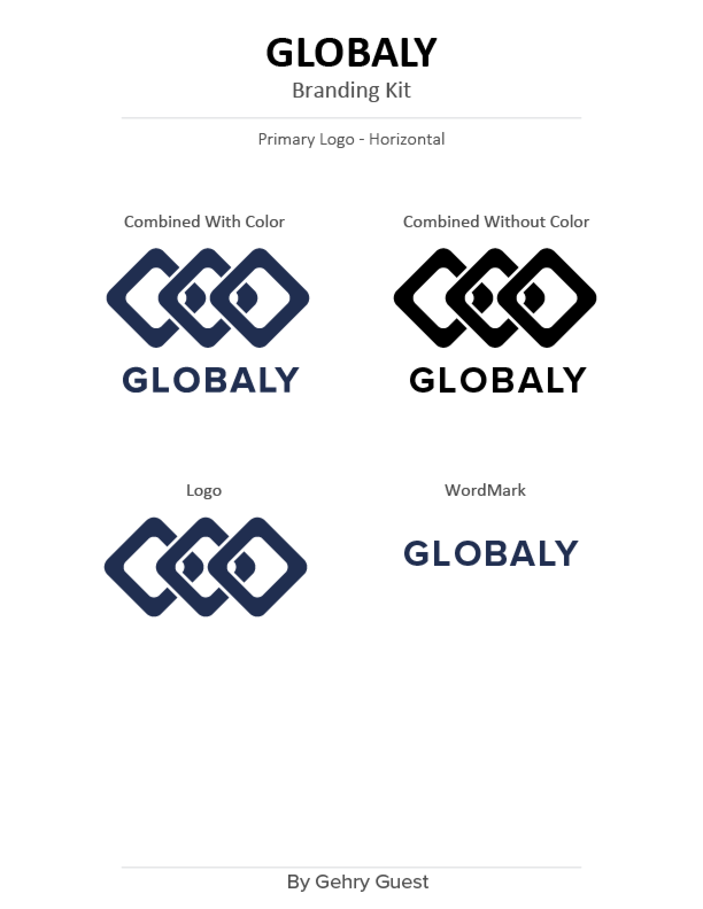
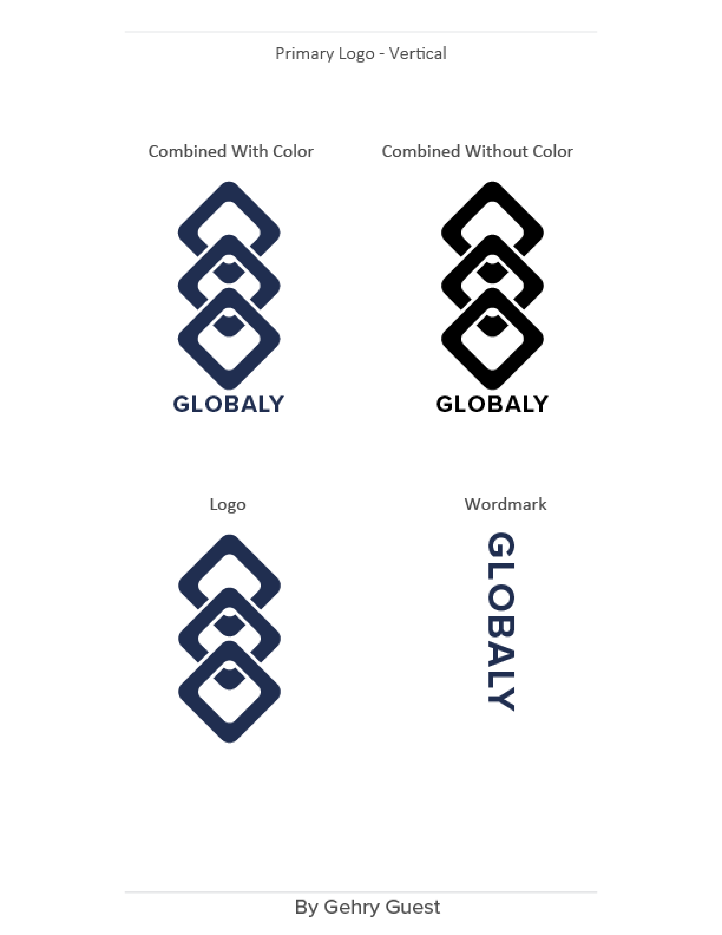
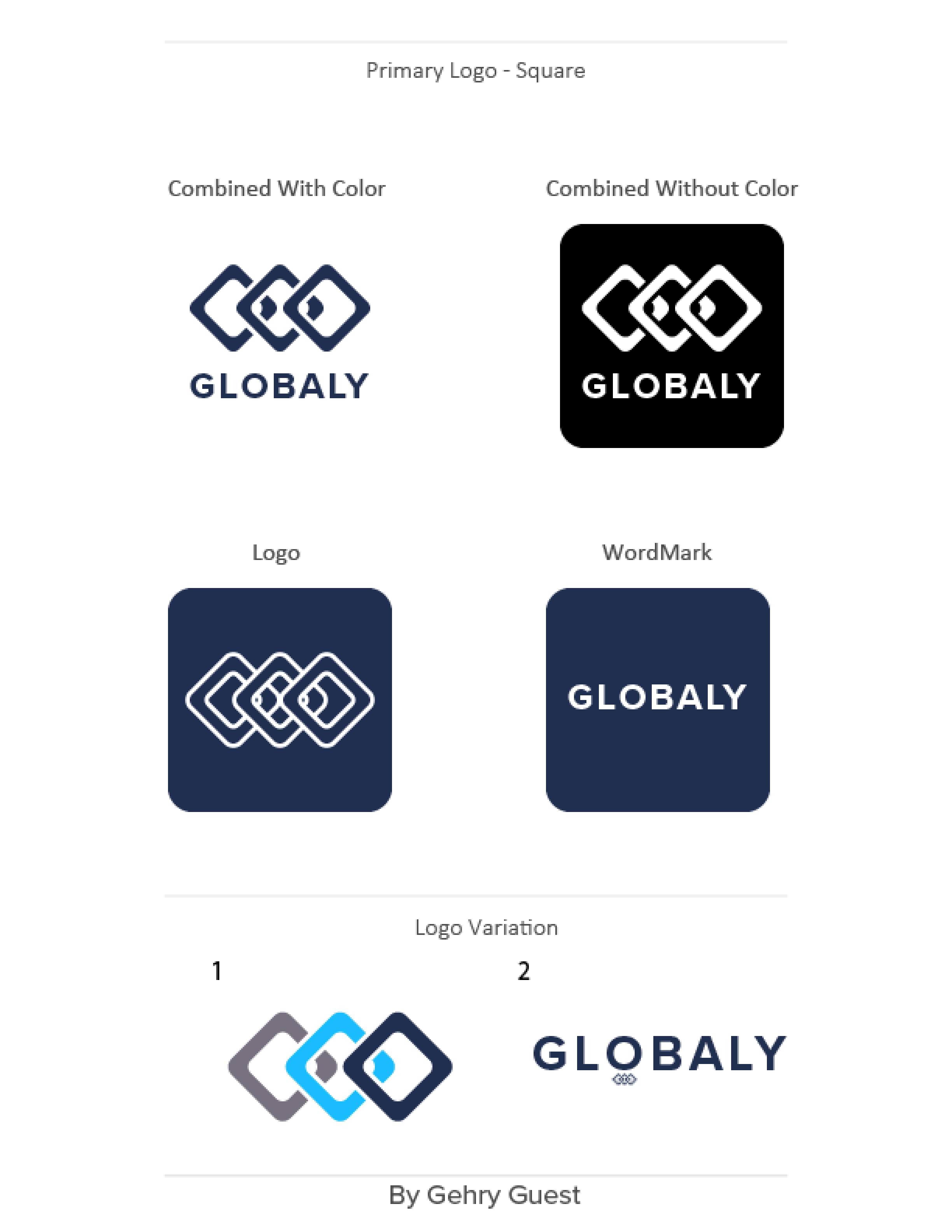
The immediate and obvious thought was some sort of globe symbology for Globaly. Thus everyone was going to make a logo with some sort of globe in it. So I went to designing a more abstract logo order to stand out. They want a logo that would be visible from far away and easily distinguishable. I figured a three chain link with professional colors will get that boldness across, I explain more about the design decisions later.
Branding Kit
New Requirements
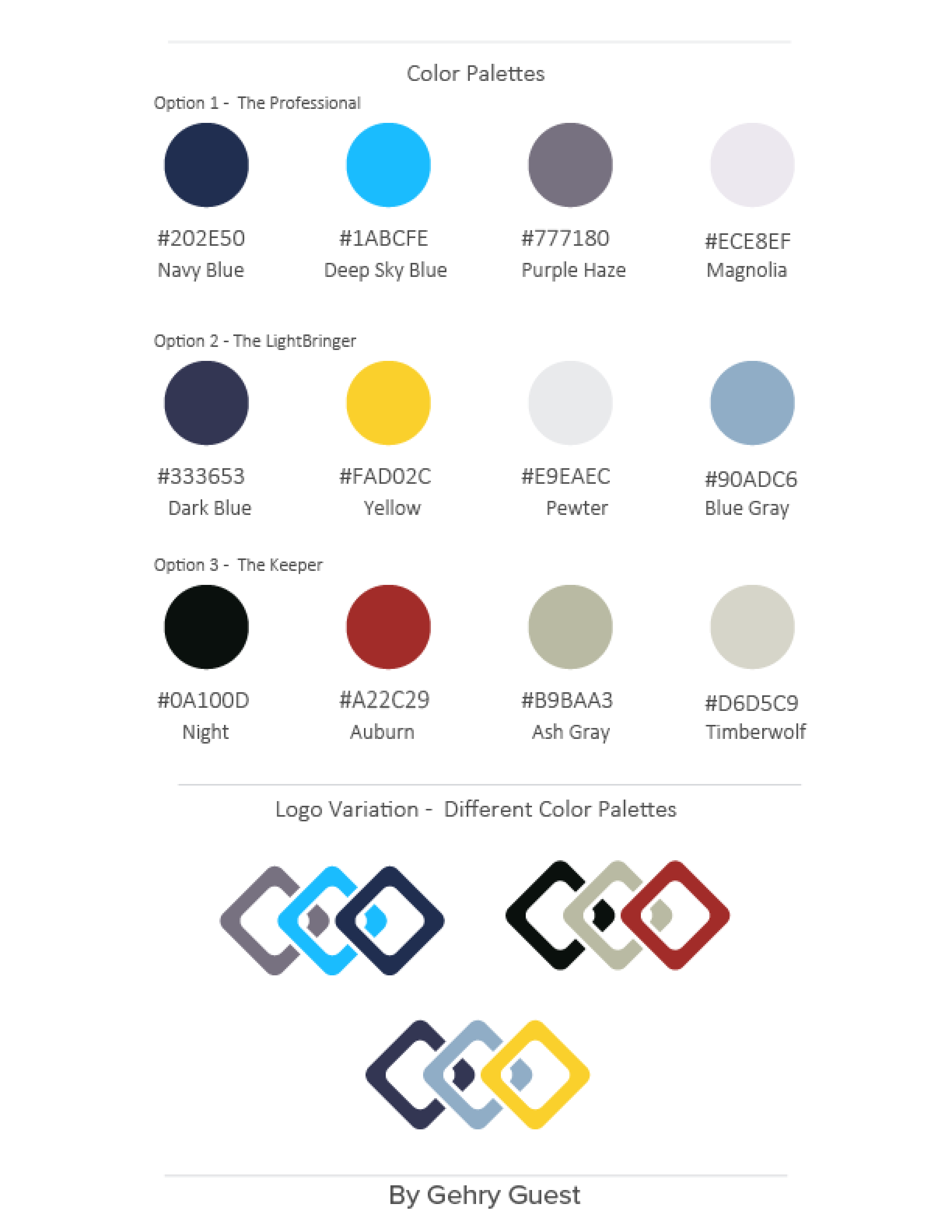
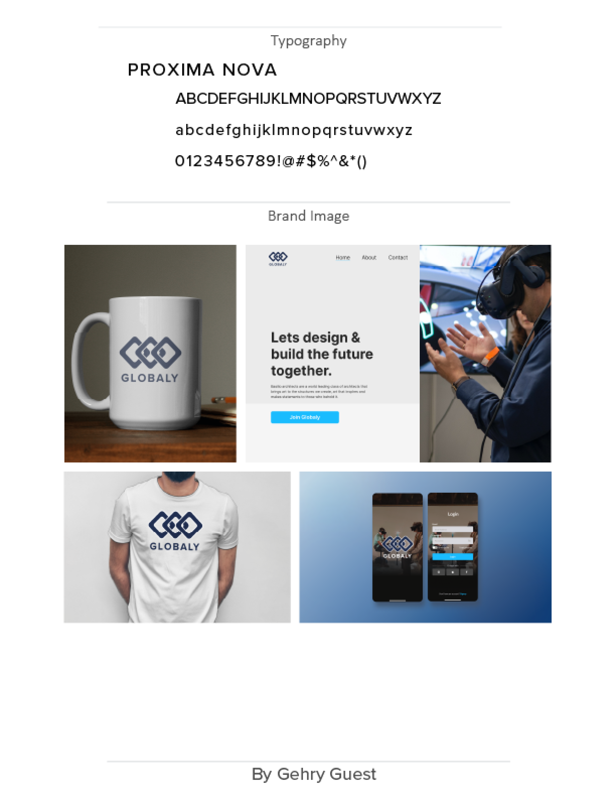
After being selected for the top ten, the judges requested a branding kit to be created alongside the logo. This kit required horizontal, vertical, and square versions of the logo, as well as various color palette examples, typography options, and mockup images. Additionally, they needed a design rationale: why were those specific colors chosen? How does the logo effectively convey Globaly's story?
Design Choices
- Why the colors? The colors needed to be professional as stated in the initial requirements. The navy with a white outline gives a bold and immediately recognizable logo but one that depicts elegance and sophistication.
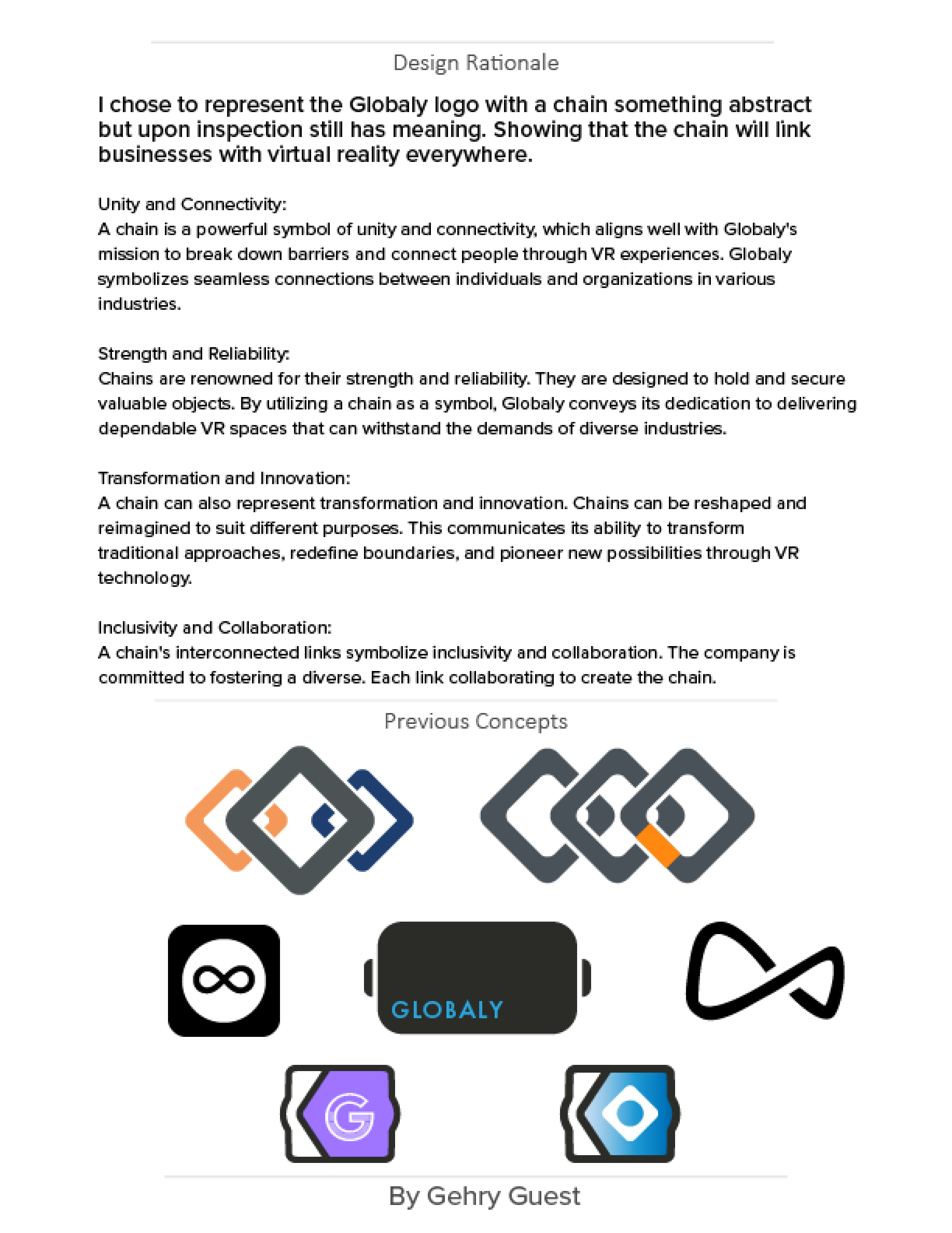
- How does this tell Globaly's story? Since Globaly was a VR connection company it will be touching hundreds of industries, it would be linking individuals and organizations together in a strong, reliable, and flexible manner. Each link being equal size also depicts inclusivity, that all are equal. That's the symbology behind the choice of the of the chain links logo.
Competition Outcome
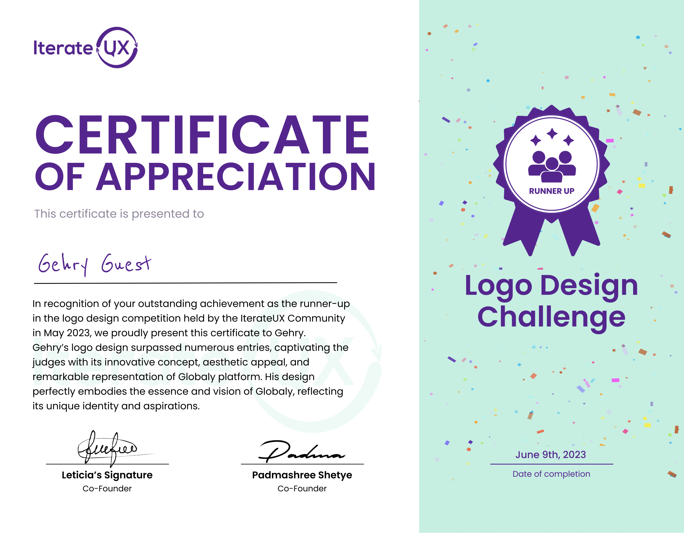
2nd Place!
The race is was so close the judges needed an extra weekend to decide. Between my logo and another I came out in second place, something i'm pretty happy with since this was my first logo competition. I had anticipated that my logo wouldn't incorporate any globe iconography; instead, I aimed for a bold approach and its performance surpassed my expectations, I received a shout-out and a coupon for free entry on the next competition.
